“Harvesting Prosperity” for Lupin Human Welfare & Research Foundation
The “Harvesting Prosperity” for Lupin Human Welfare & Research Foundation (LWHRF) has been designed with a strong visual storytelling approach, reflecting the bond between farmers, their livelihoods, and sustainable agricultural growth.
-
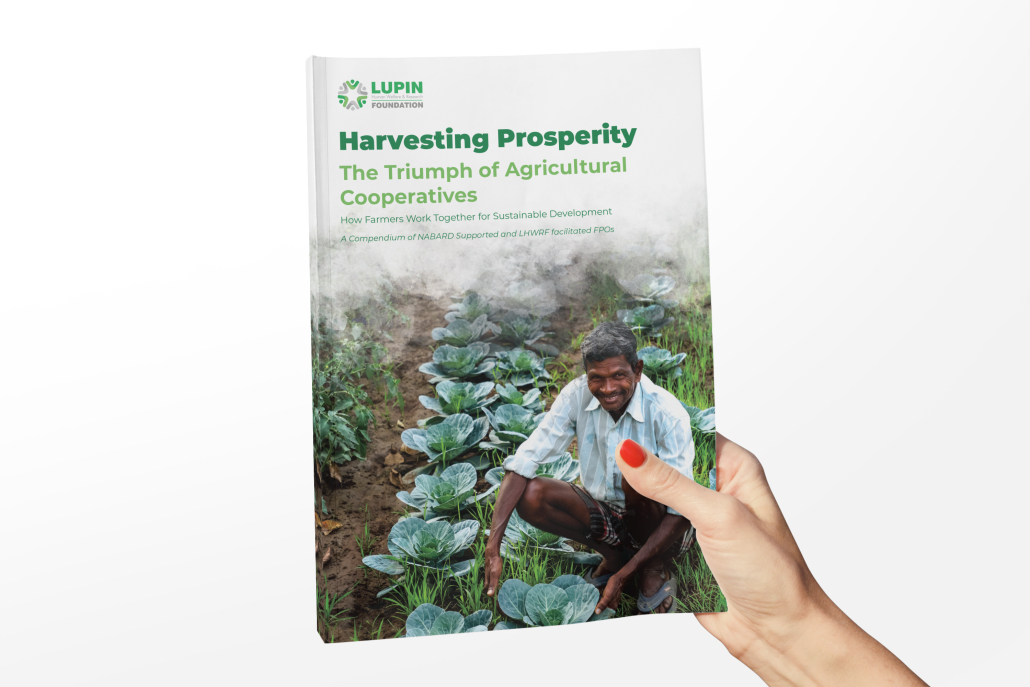
Cover Page: The cover features a farmer amidst his cabbage fields, symbolizing prosperity, hard work, and the collective strength of agricultural cooperatives. The title is set in bold, clean typography with a fresh green palette, reinforcing the theme of growth and sustainability.
-
Typography & Colors: A mix of modern, sans-serif fonts with earthy greens and browns conveys clarity, trust, and a connection to the land. Green is consistently used as a highlight to symbolize growth, while subtle earthy tones provide balance and warmth.
-
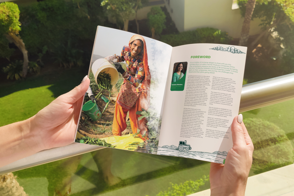
Imagery: Authentic, candid photographs of farmers in their natural working environments are central to the design. These images establish an emotional connect, celebrating resilience and community spirit.
-
Layouts & Graphic Elements:
-
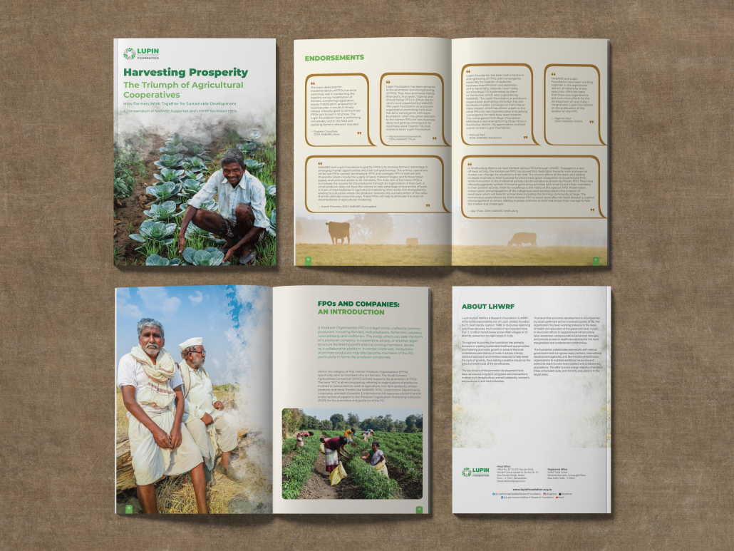
Testimonial/Endorsement Pages use quotation-style boxes, structured neatly with icons and minimal illustrations (like cows in the background), adding depth and relatability.
-
Content Pages follow a clean grid layout, blending text with large visuals to keep the narrative engaging.
-
About Section maintains a minimalistic style, ensuring easy readability and focus on organizational impact.
-
-
Design Language: Overall, the design language is grounded, people-centric, and narrative-driven. It uses visual storytelling to highlight the role of FPOs and cooperatives, emphasizing community empowerment, sustainability, and agricultural progress.

