SwaTaleem Foundation 5-Year Report
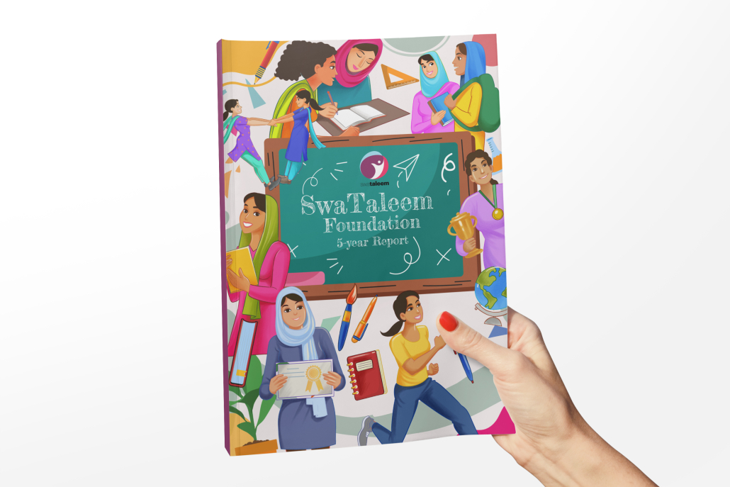
The SwaTaleem Foundation 5-Year Report has been designed with a vibrant and human-centered approach that reflects the organization’s commitment to empowering girls through education. The cover uses illustrative storytelling, showcasing diverse young learners, symbols of education, and collaborative energy—capturing the essence of growth, inclusivity, and hope.
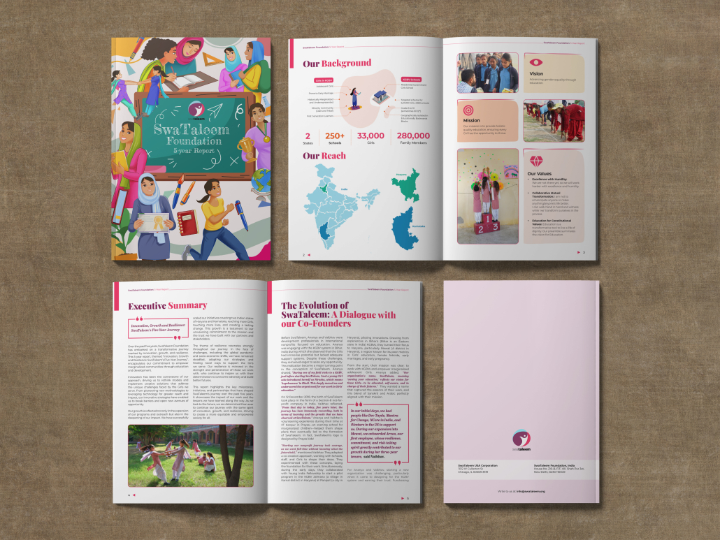
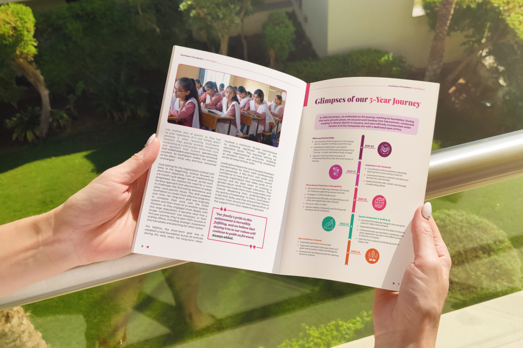
Inside pages follow a clean, structured layout with a balance of text, data visuals, and photographs. The color palette is anchored in warm pinks and soft pastels, symbolizing compassion, care, and optimism. Infographics and maps are used to present reach and impact in an accessible way, while bold typographic highlights draw attention to key facts and figures.
The design language focuses on:
-
Vibrant Illustrations – making the report approachable and engaging.
-
Minimal, Clear Infographics – ensuring data is understood quickly.
-
Human-Centered Photography – reflecting real stories of change.
-
Consistent Visual Identity – aligning with SwaTaleem’s mission and values.
Overall, the report design communicates impact, inclusivity, and optimism—making complex information easy to grasp while keeping the human stories at the heart of the narrative.

